MEDTRACK
Patients often experience long wait times in waiting rooms. However, the design of waiting rooms does not effectively address the issue.
This project began with collaborative research with Danielle Mou and JP Leon and then transitioned into individual ideation and final design stages.
- Group Research
- Pre-liminary Research
- Fly-on-the-wall
- Case Studies
- Interviews
- Ideation
- Persona & Experience Map
- Brainstorming
- Paper Prototype
- Usability Testing
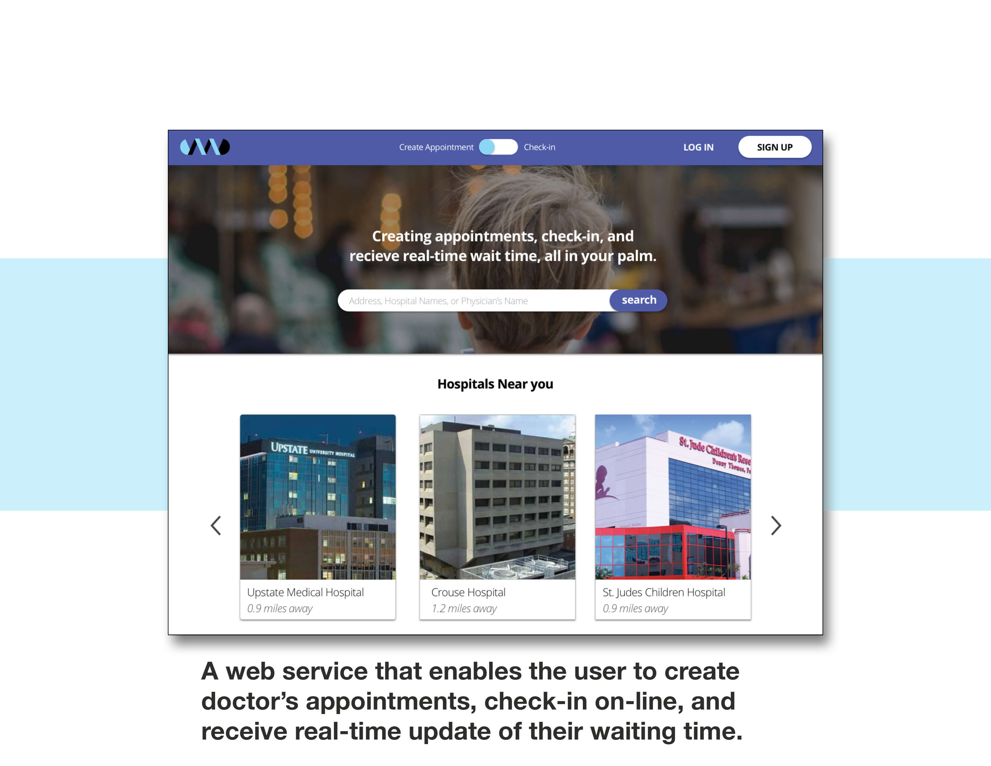
- Medtrack
- User Experience
- User Interface
- Features
- Mockups
Pre-lim Research
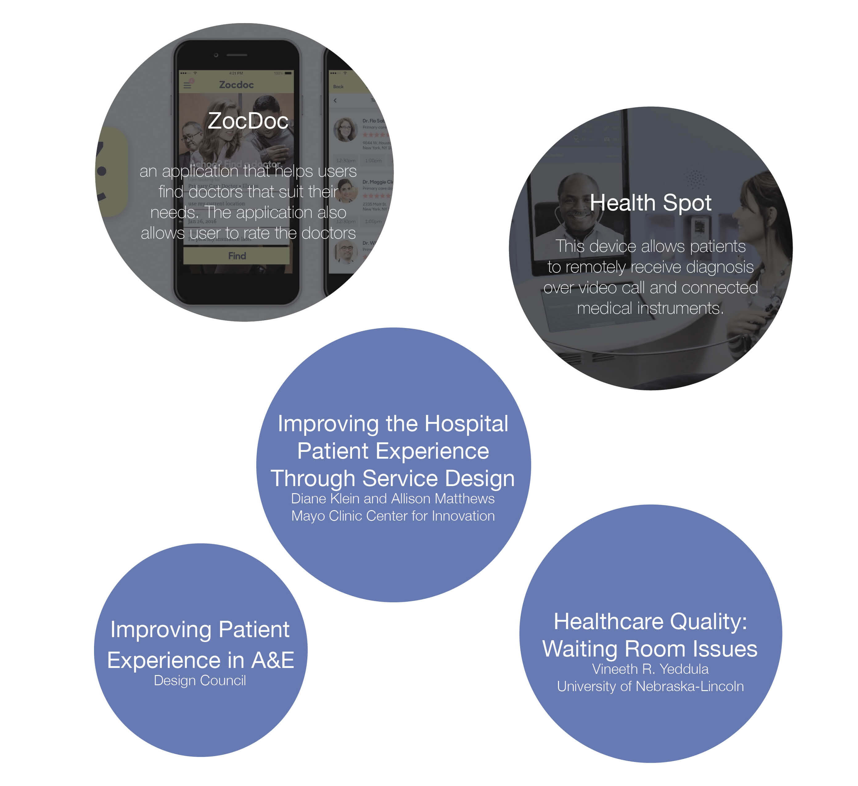
We studied scholarly articles and case studies to discover how to improve patients’ experiences in waiting rooms.
Fly-on-the-wall Observation
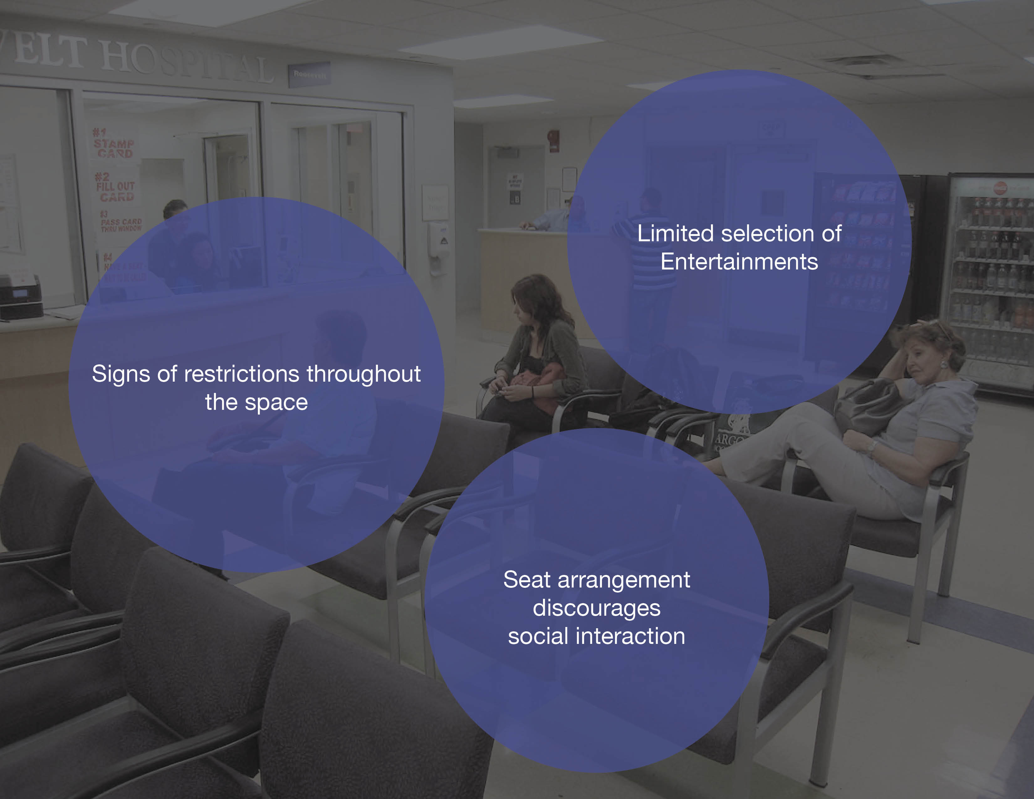
I observed several waiting rooms in nearby hospitals and health centers. I focused on patients’ behaviors, interactions among patients, and the waiting room layout.
-
Findings
- Patients rarely engage with the entertainment provided by facilities.
- Seat arrangements discourage social interaction among patients.
- Patients are mostly on their phones and laptops.
Interviews
I interviewed people who have recently visited hospitals or the SU Health Center. The interviews revolved around the pain points and the success of the experience.
-
Findings
- A clear indication of waiting time can reduce patients’ stress in the waiting room.
- Patients in the SU Health Center often found the check-in process confusing and receptionists unhelpful.

INSIGHTS
For visitors of the SU Health Center, the confusing check-in process and unfriendly receptionists compound the long wait time’s frustration.
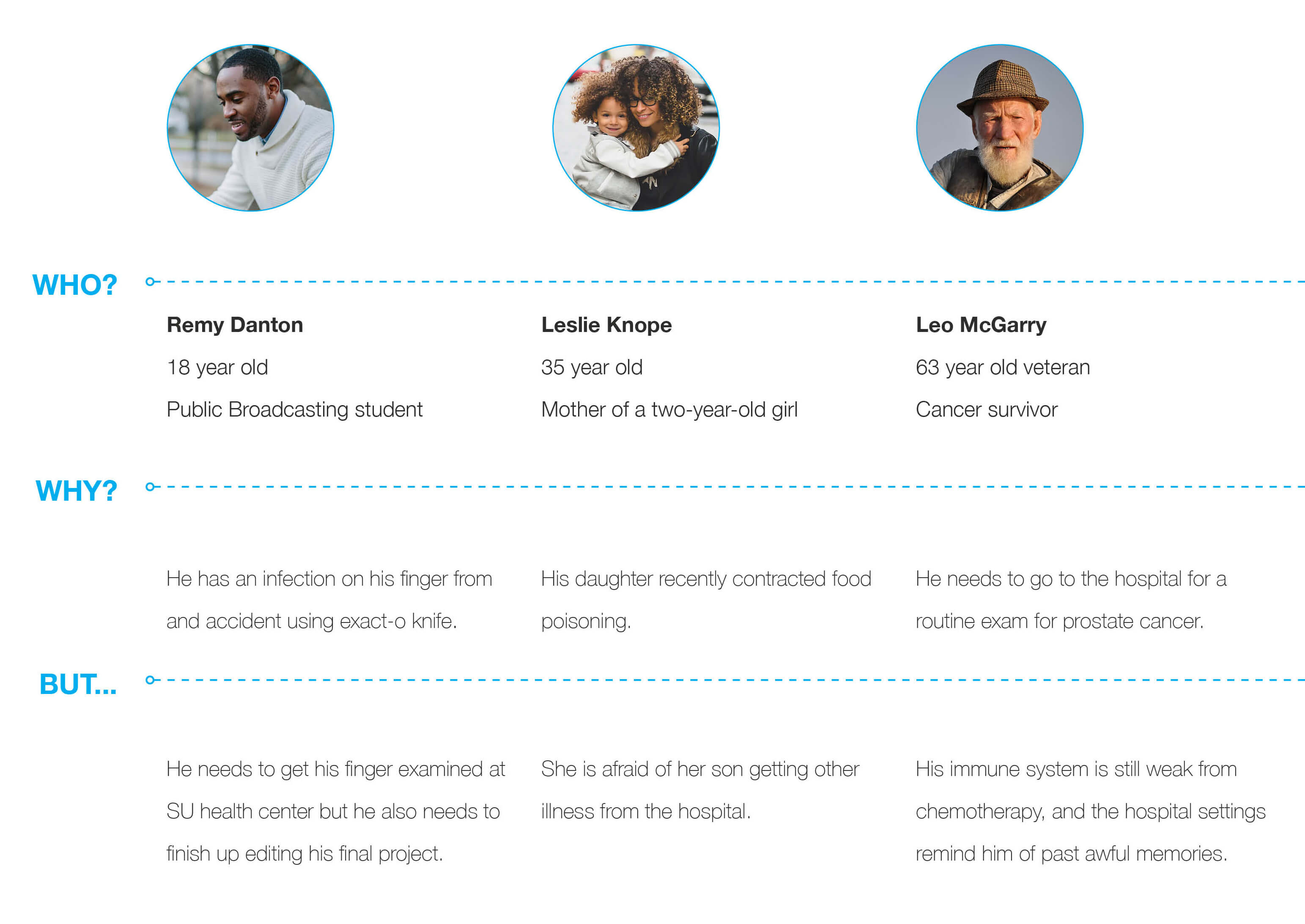
Archetype
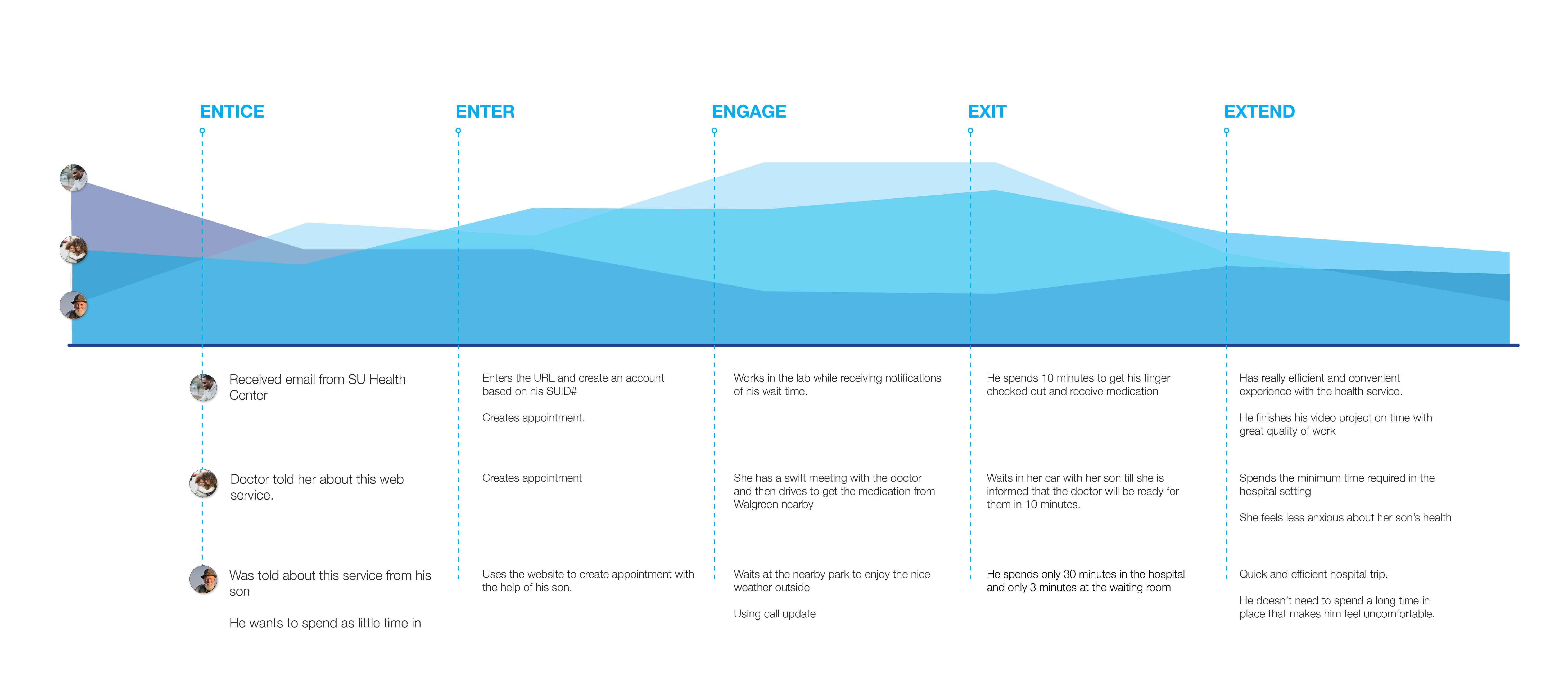
Experience Map
Brainstorming
I combined several ideas to create a web service that can streamline creating and checking in to appointments.

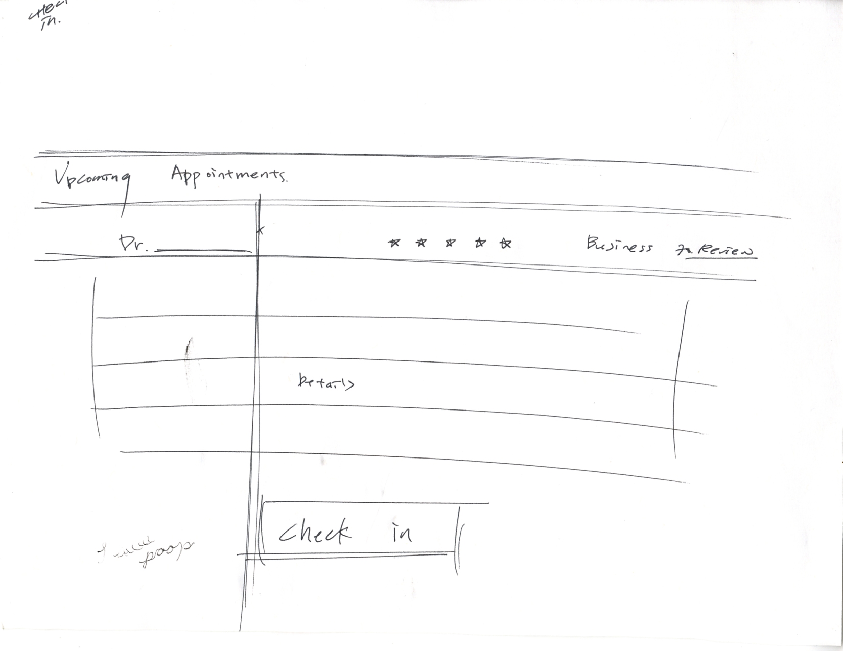
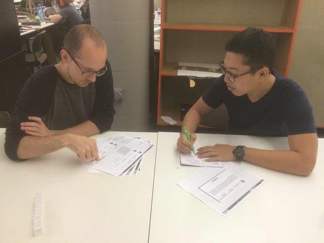
Usability Testing
Through usability testing with paper prototypes, I refined the wireframe and visual layout by understanding the obstacles and successes from users’ perspectives.
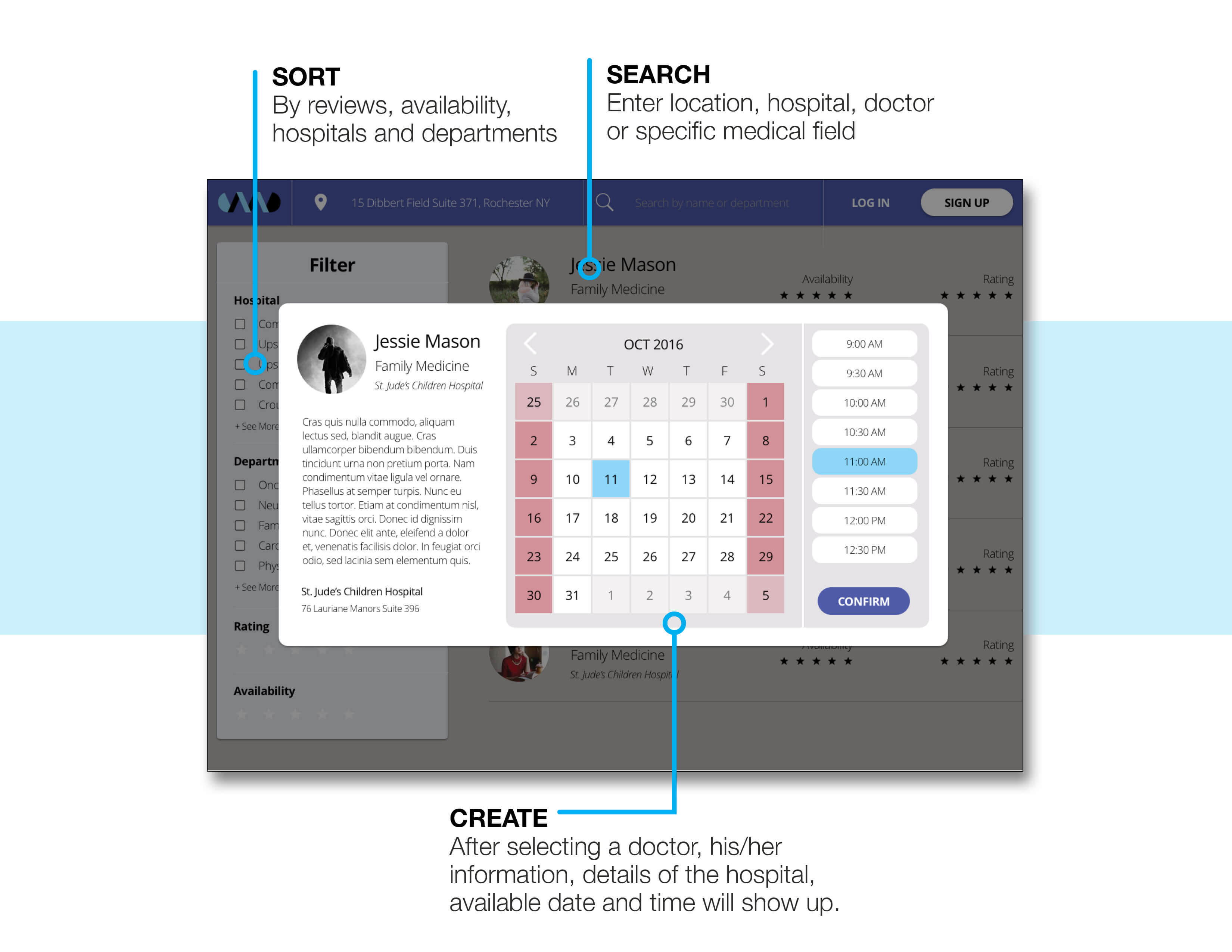
Search -
I modified the search bar and the result page to accommodate different keywords and search results.
Account -
I added a clear indication of a drop-down menu.
Modify-
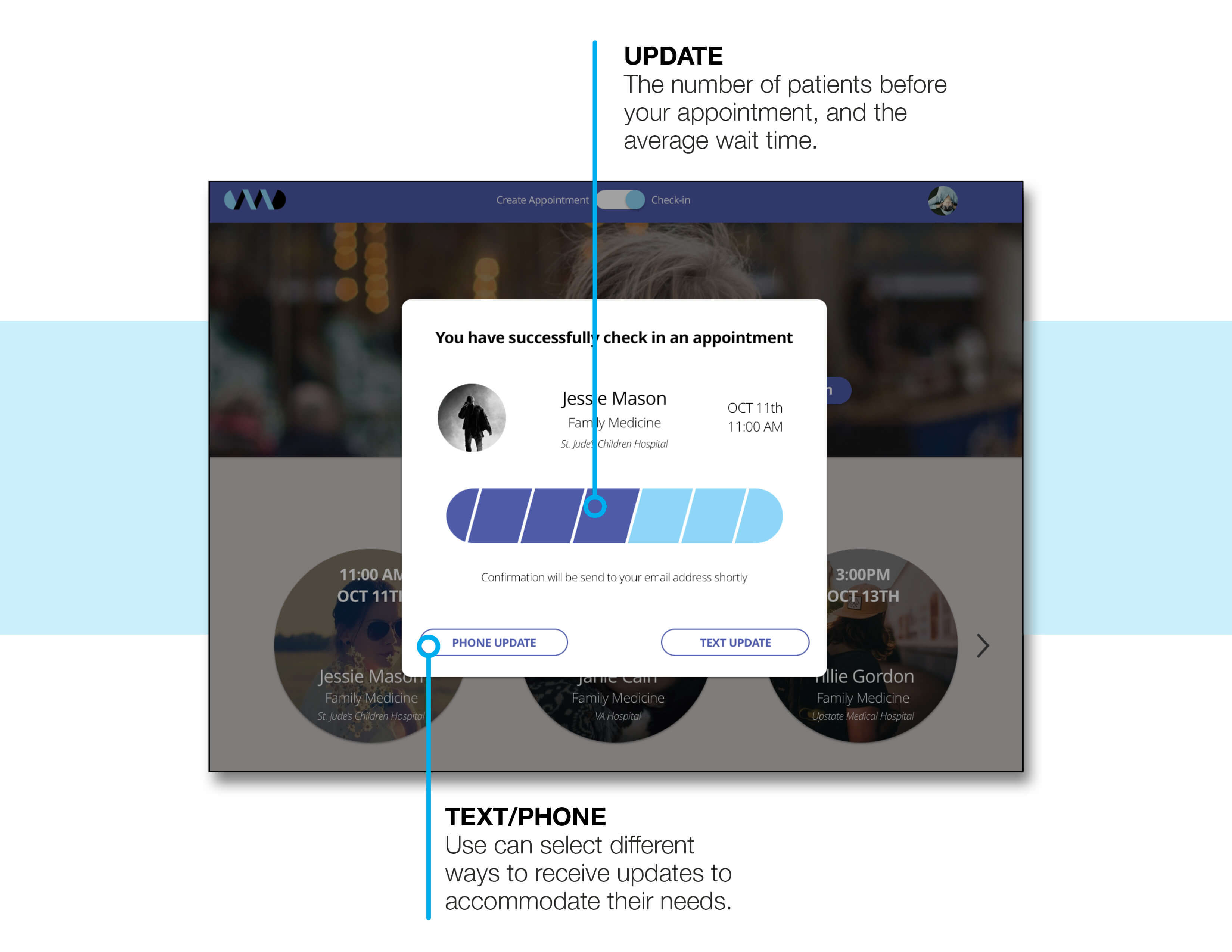
I merged the check-in and appointment information pages to display the information.
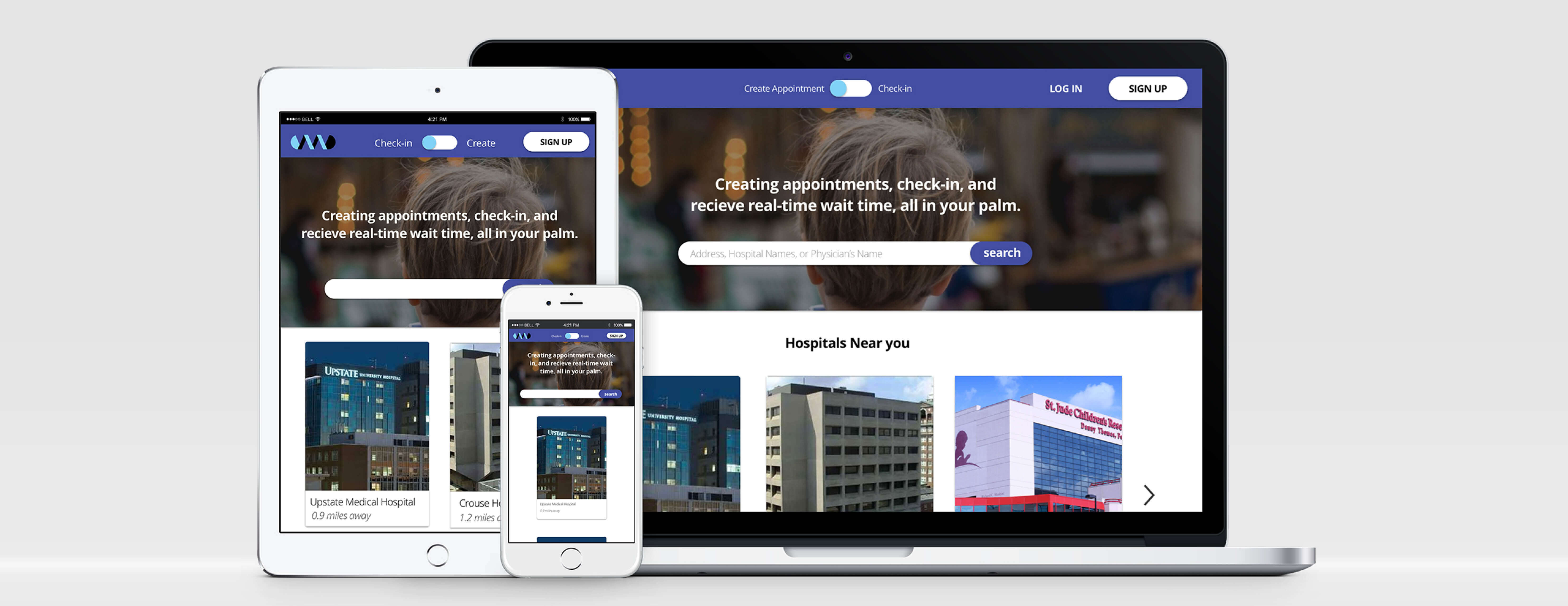
Color -
I chose two colors to distinguish the respective paths of appointment-making and check-in processes.
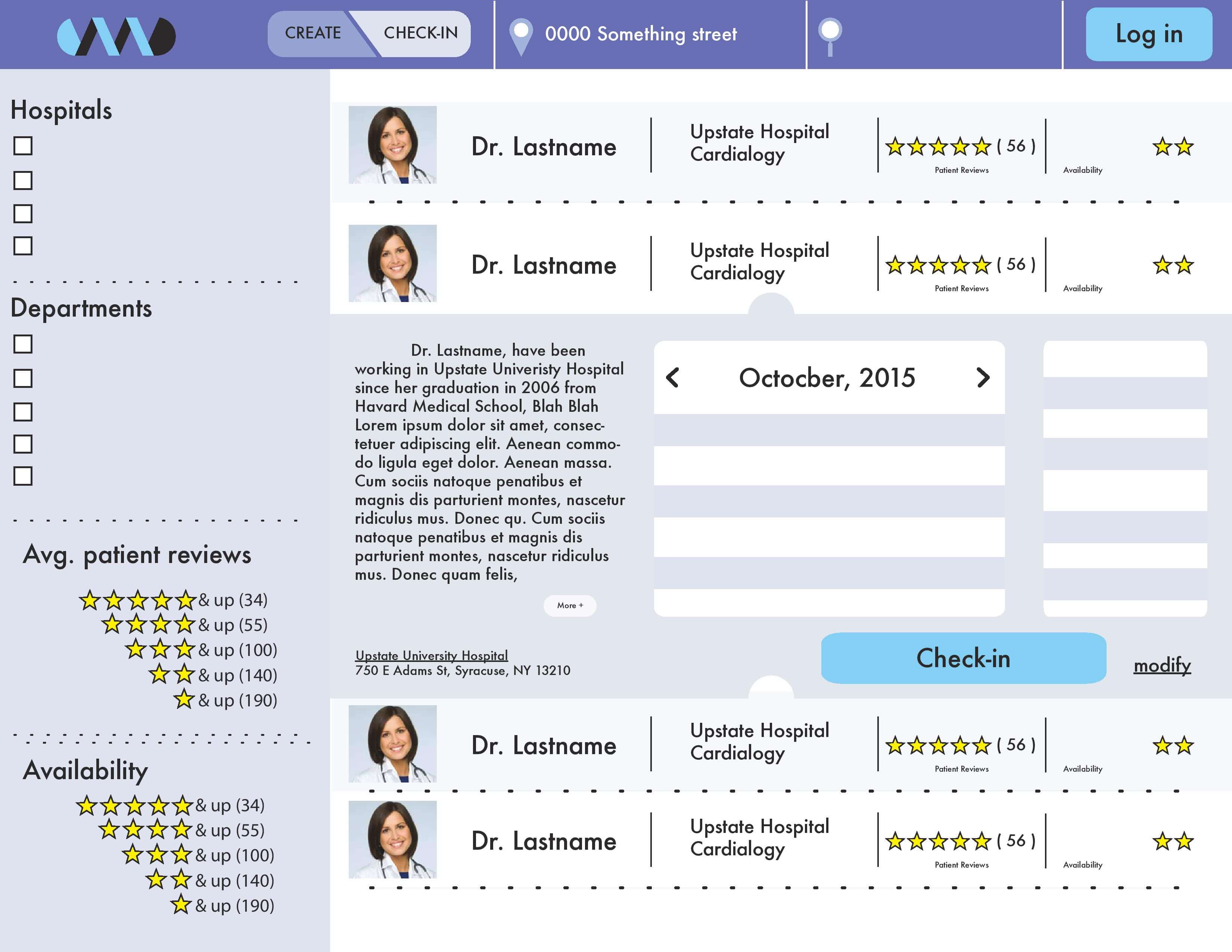
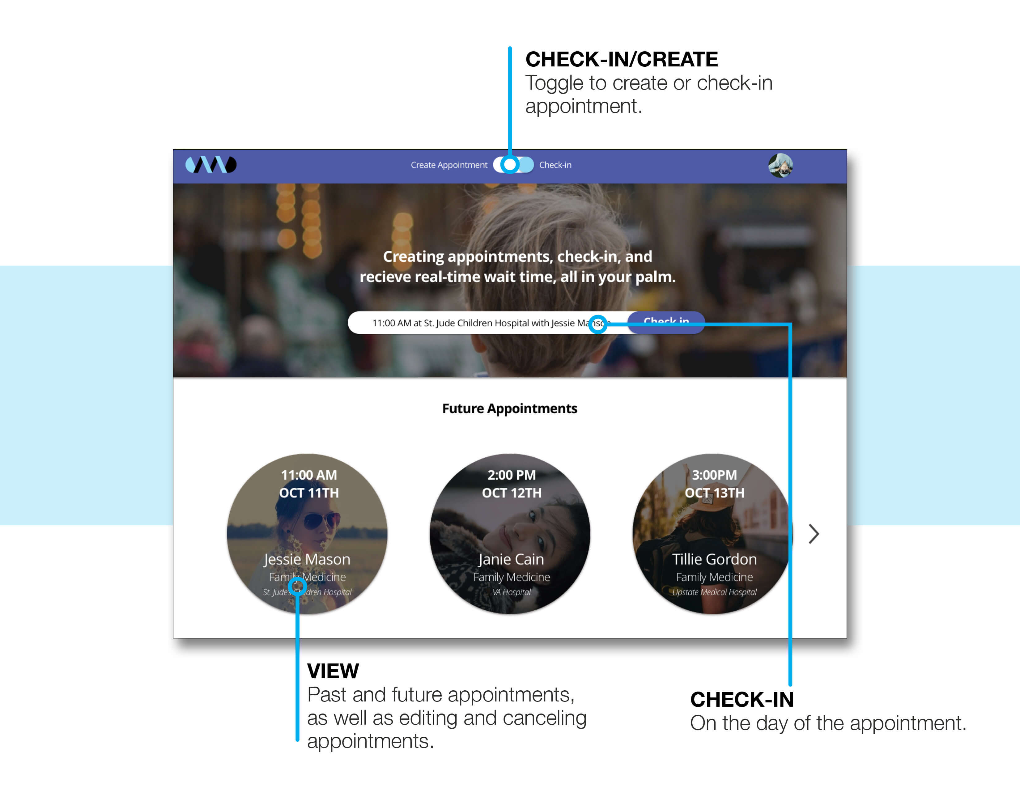
Experience Design
Users can toggle between creating an appointment and checking in directly on the fixed navigation bar. The appointment-creating section is now a modal for a cleaner look and better interaction.
The new search and filter function manage the search results better.